Nightingales Recruitment
Redesigning a healthcare recruitment website for clarity, trust, and usability — transforming a dated experience into a modern digital platform.
Visit Live Website
Redesigning a healthcare recruitment website for clarity, trust, and usability — transforming a dated experience into a modern digital platform.
Visit Live WebsiteNightingales Recruitment | UK-based healthcare staffing agency.
UI/UX Designer | WordPress Developer
2 Months
Figma · WordPress
The previous website lacked structure and emotional warmth, crucial in the healthcare recruitment space. Navigation was unclear, visuals were outdated, and neither job seekers nor employers could easily find what they needed. The goal was to modernize the site and make it feel both professional and compassionate.
I conducted a competitor review and basic heuristic analysis to identify UX pain points in existing recruitment sites. The biggest issues were cluttered layouts, poor hierarchy, and confusing user flows.
Reorganized navigation into clear user paths, separate entry points for job seekers and employers.
Focused on content hierarchy and simplified flows before refining visuals.
Introduced a calm, professional aesthetic with coral accents and generous whitespace.
Built interactive prototypes in Figma for stakeholder feedback and usability checks.
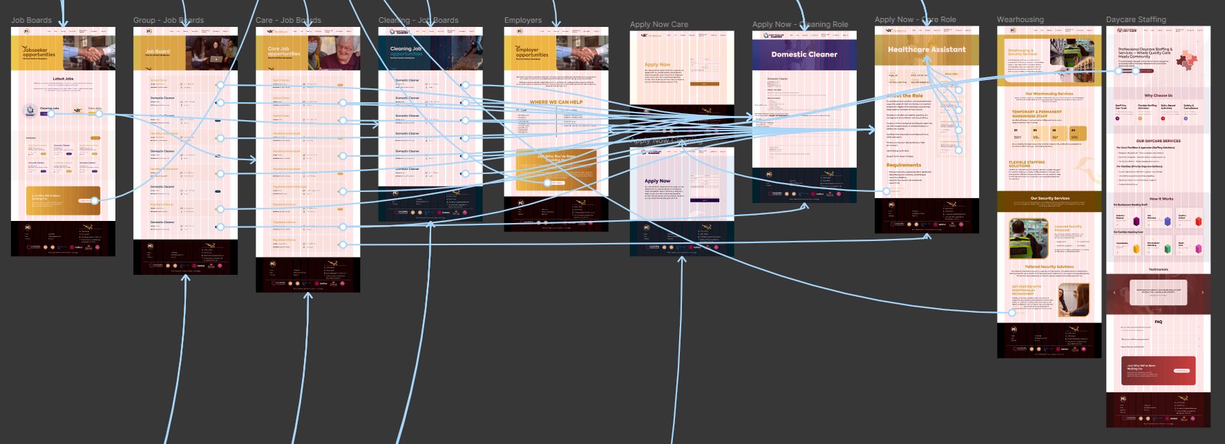
The redesign focused on simplifying navigation and modernizing visuals. The homepage now emphasizes two core actions: finding jobs and hiring talent, creating immediate clarity for both audiences.

This project reinforced how design clarity and empathy drive trust in healthcare spaces. Building for two user groups — job seekers and employers — taught me to balance information density with simplicity.
Visit Live Website