Case Study / Glo
A visual system for a brand that never stops communicating.
Glo is a Nigerian telecommunications provider. The work shown here is the repeatable visual system built to carry its communication across connectivity campaigns, device education, public-health messaging and everyday social content — not a single campaign.

The Project
One brand.
Many reasons to communicate.
Glo's communication needs span connectivity offers, device education, public-health and environmental messaging, workplace culture, and everyday social engagement — each with its own audience and tone.
The evidence here isn't a single campaign. It's a visual language built to stay recognizably Glo across all of it — the same green, the same logo mark, the same structural habits, applied again and again without losing its identity.
The System
One visual language.
Many campaign systems.
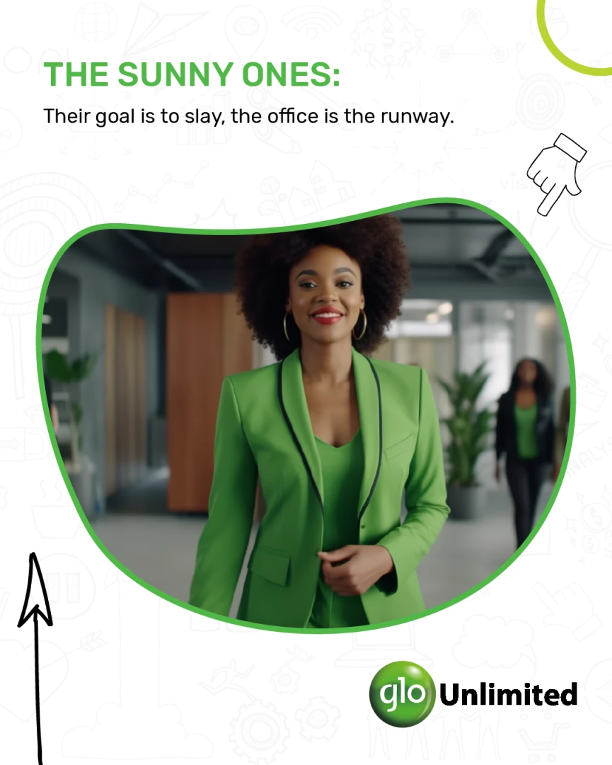
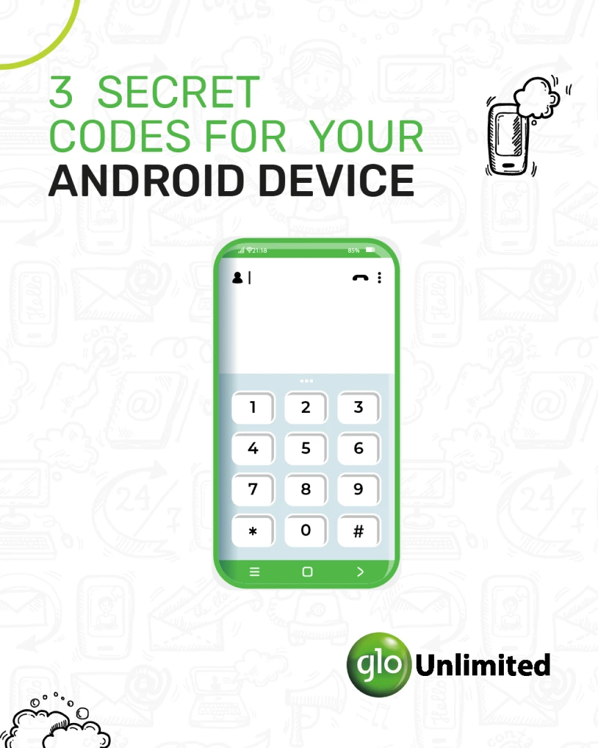
A connectivity offer, a device-education tip and a workplace-culture post — three different templates, three different audiences, all unmistakably Glo.


Campaign Variants
Same campaign.
Different executions.
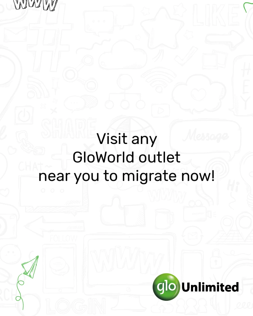
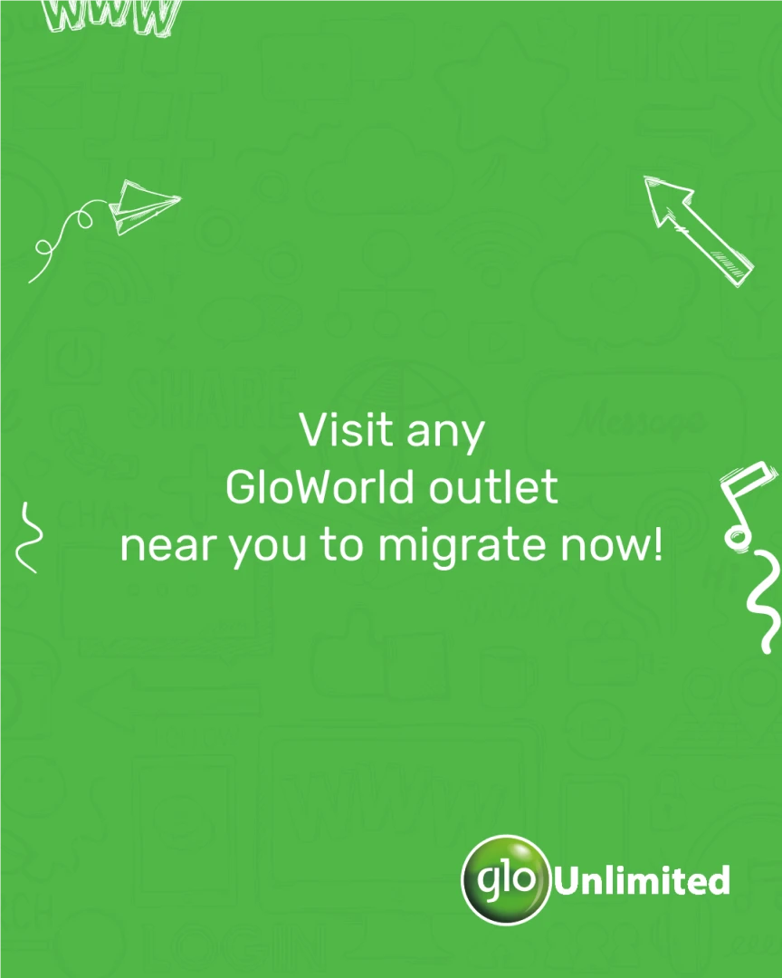
The 4G migration message ran as two full, parallel creative treatments — a white-background edition and a green-background edition — carrying the identical offer copy on two different visual moods.
White-background edition


Green-background edition


Beyond the Post
Beyond the social post.
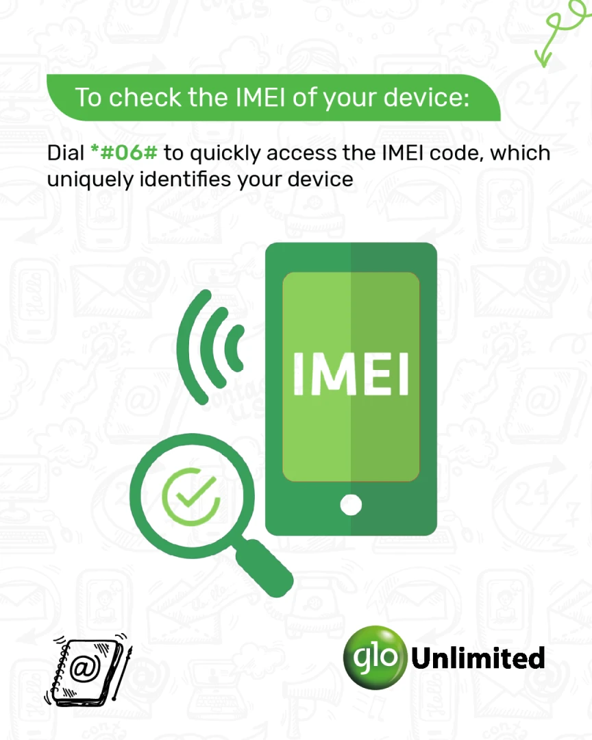
The same system also carried real device-support content — practical, dial-code-level instructions rendered as actual phone-UI mockups, not decorative graphics.

Communication at Scale
A system built for volume.
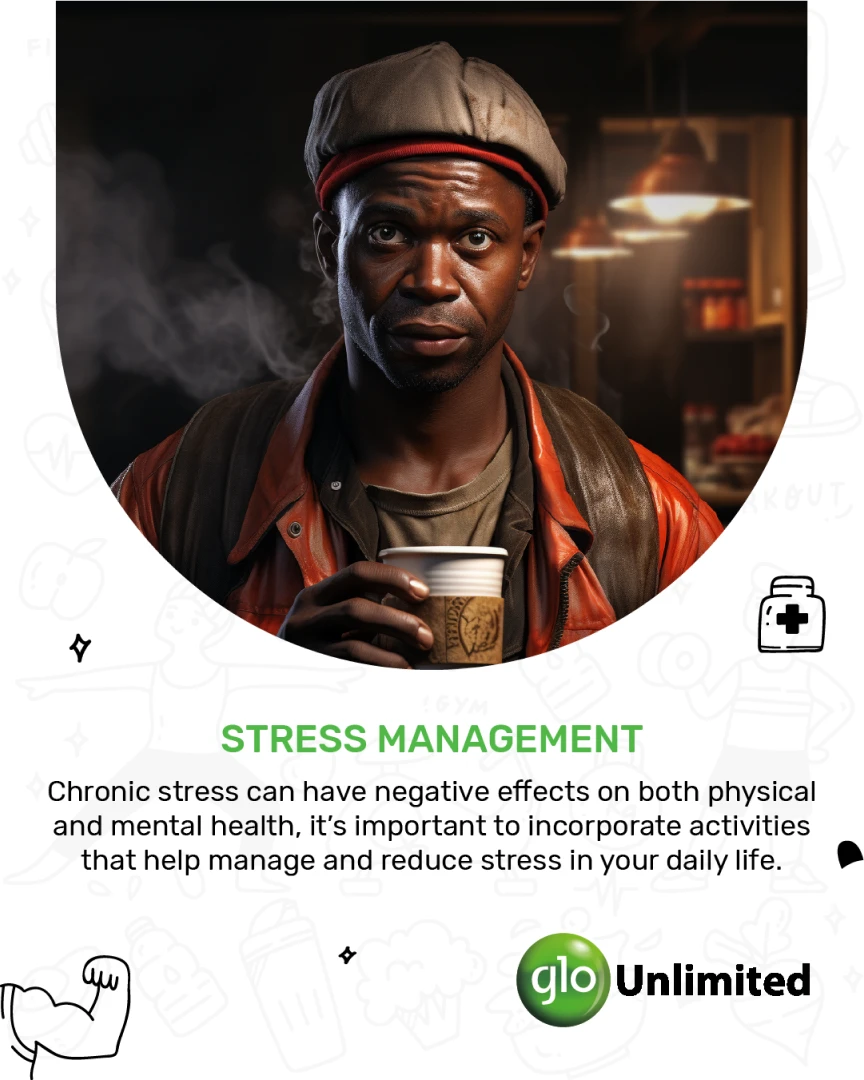
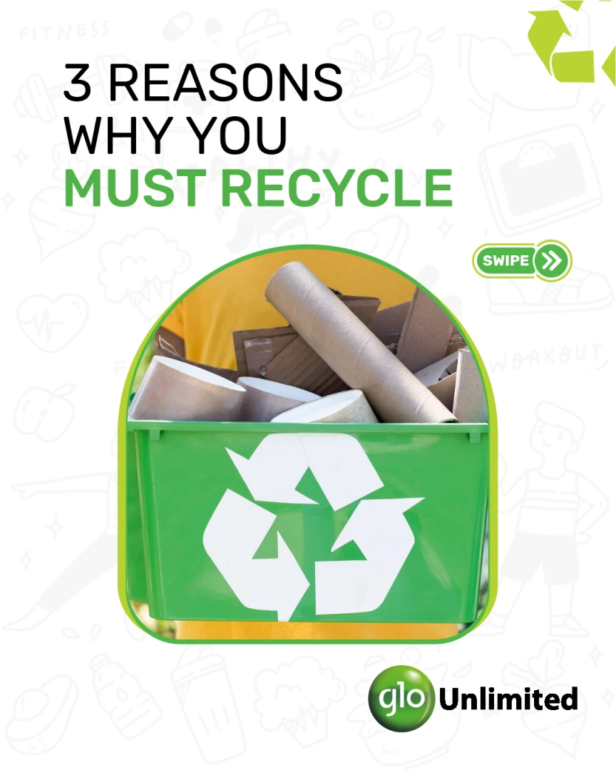
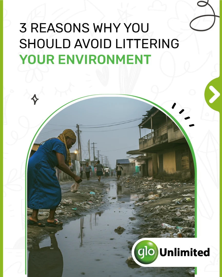
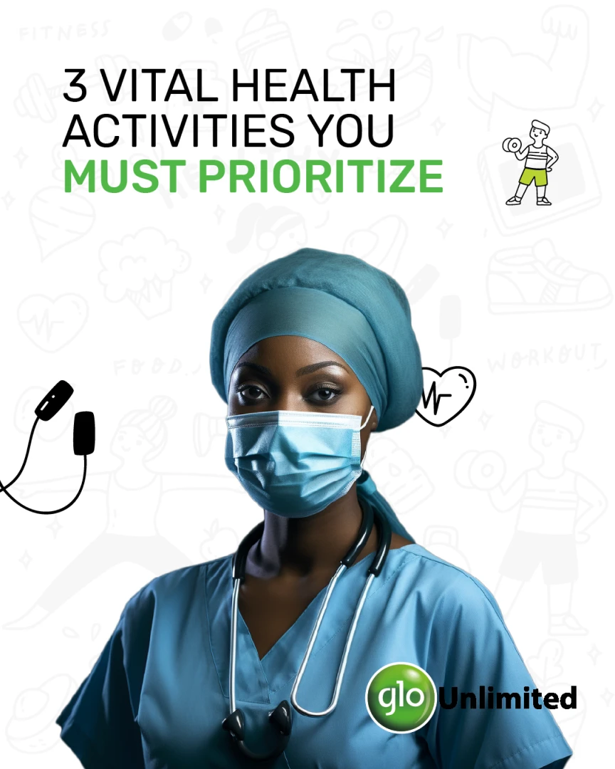
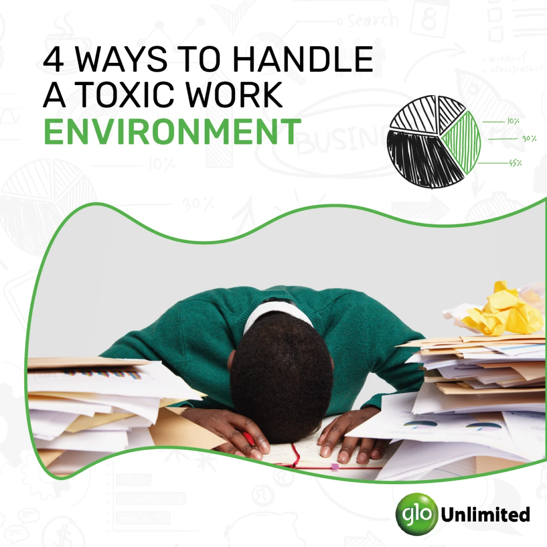
A four-part CSR program — recycling, anti-littering, health and cough-safety — sits alongside a running calendar of workplace and lifestyle content. Same system, week after week, topic after topic.




Range & Register
Different audiences.
Different moments.
Same visual language.
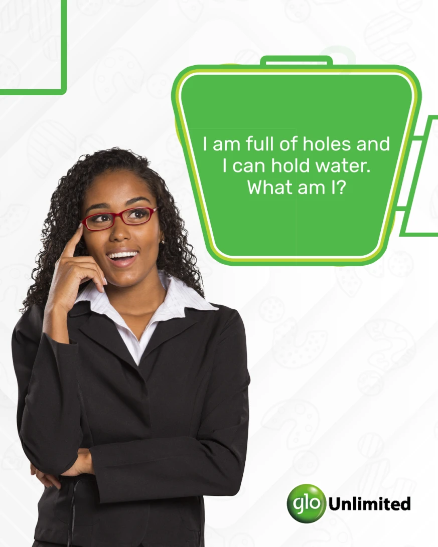
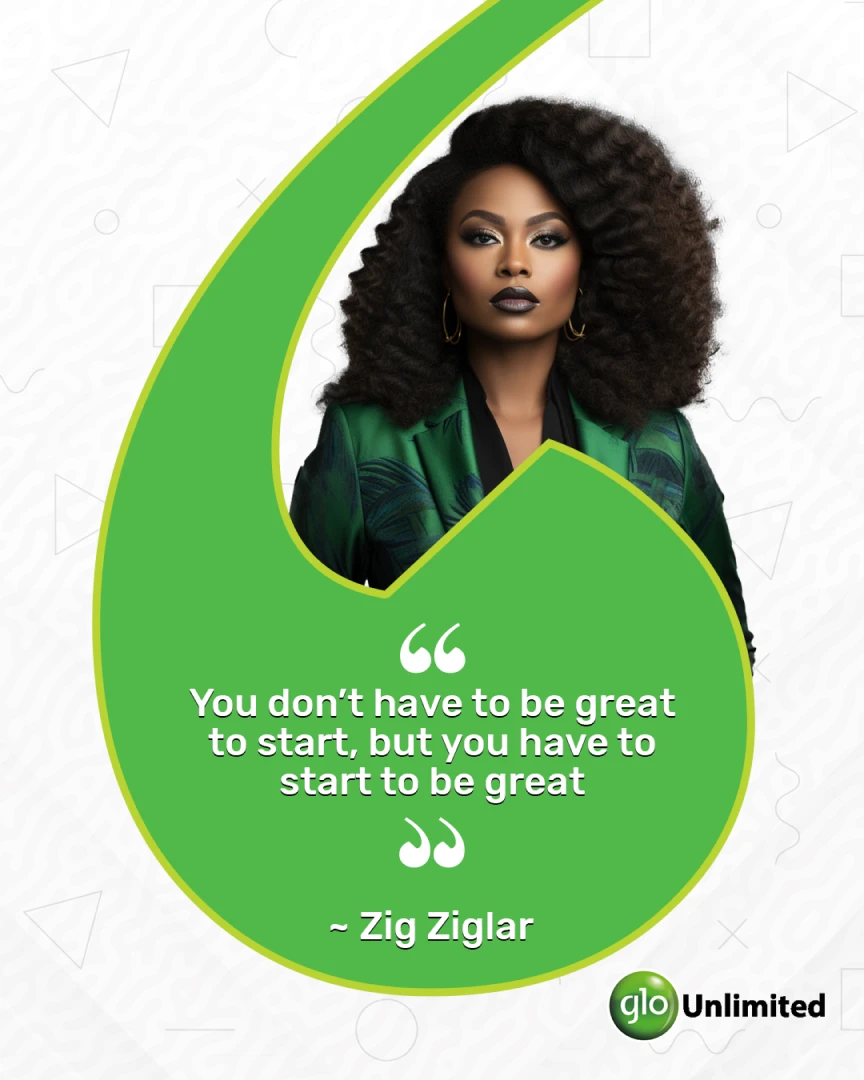
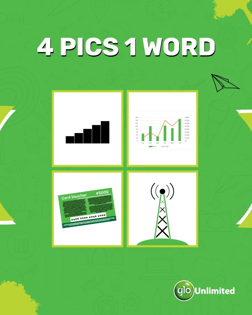
From office humor, to a serious public-health message, to a playful riddle, to an inspirational quote — the tone shifts with the moment, but the system underneath stays the same.